What Makes Minimalist Website Design So Effective

Minimalist design isn’t about having less — it’s about doing more with focus. A well-executed minimalist website doesn’t feel empty or cold. It feels clear. It helps users find what they need without distraction, confusion, or noise. And in a world where people decide within seconds whether to stay or leave, clarity is everything.
Minimalist website design is built on intention. Every visual element, every word, every interaction serves a purpose. There’s no filler. No clutter. Just a layout that highlights what matters most, and a structure that respects the user’s time and attention.
This approach works especially well for brands that want to communicate trust, professionalism, or modernity. Clean typography, open space, and simple navigation give the impression that the company knows what it’s doing — and knows how to say it without overexplaining.
It also helps with performance. Sites built with a minimalist approach tend to load faster and work better across devices. Fewer scripts, fewer images, and lighter layouts mean better responsiveness and a smoother experience on mobile.
But minimalism isn’t about stripping everything away. It’s about making careful choices. A strong minimalist site still reflects personality. It uses color, motion, and layout strategically. The restraint is what gives those elements their power.
There’s also a usability advantage. When there’s less on the screen, users find their way more easily. Calls to action stand out. Content gets read. Important sections don’t compete with flashy extras. That simplicity often leads to higher conversion rates, especially when paired with strong copy and thoughtful design.
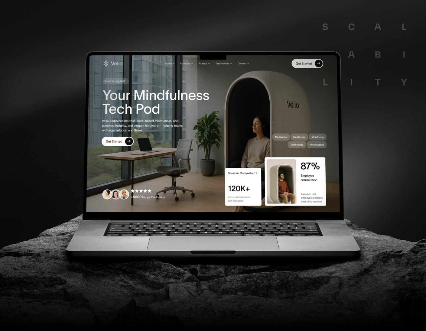
At Scalability Inc., we use minimalist design not as a trend but as a tool. We help brands cut through the noise and say what they need to say — no more, no less. Because clarity doesn’t mean being boring. It means being understood.
Want a website that feels clean, modern, and purposeful? Let’s design with focus.