What Makes a Great UI for a Healthcare App?

Designing a healthcare app means more than making it look good. It means creating a user interface that feels safe, clear, and reliable, especially when users may be anxious, rushed, or dealing with sensitive information. A great healthcare app UI doesn’t just look trustworthy. It behaves that way too.
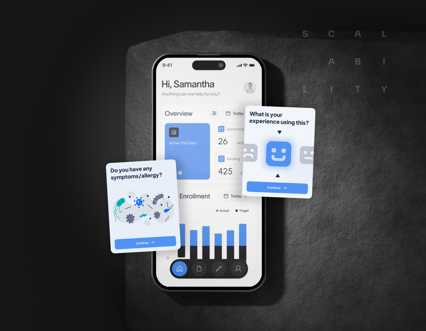
In healthcare, clarity is everything. Users don’t want to hunt for buttons, decipher icons, or guess what step comes next. The design needs to guide them gently, whether they’re checking test results, booking appointments, or logging symptoms. Every screen should answer one question: “What do I do now?”
Accessibility is a top priority. Fonts should be legible, contrast strong, and interactions simple. Not every user is tech-savvy, and many may be older or dealing with impairments. That means avoiding jargon, minimizing cognitive load, and building interfaces that feel calm, not cluttered.
Trust is also visual. Clean layouts, consistent patterns, and clear feedback signals help users feel secure. If a form submission goes through, confirm it. If something is loading, show that. These small details make users feel the app is working with them — not against them.
One of the most common mistakes in healthcare UI is overcomplication. Trying to show too much at once, or cramming multiple features into a single flow, only makes people disengage. Good UI separates steps clearly. It lets users complete one action at a time without confusion.
At Scalability Inc., we design healthcare apps with empathy. We think about the person on the other side of the screen,the patient, the caregiver, the provider and how to make their experience smoother. Because when people trust your interface, they’re more likely to trust your product.
Need your healthcare app to be as usable as it is secure? Let’s make it work for real people.