Mobile-First Design Principles: Why Starting Small Leads to Better Products

Designing for mobile first is not about shrinking a desktop site. It is about prioritizing what matters most to users in the most constrained environment, then building up from there. When teams begin with phones in mind, they make sharper choices about content, layout, performance, and interaction. Those choices carry forward to tablets and desktops, which leads to cleaner, faster, and more focused products.
The first principle is clarity. Mobile screens give you very little room, so the story has to be obvious. Headlines should say exactly what the page offers, primary actions should be visible without hunting, and supporting details should not crowd the view. If a message feels essential, it belongs near the top. If it is secondary, it can live behind a simple reveal.
Performance comes next. Mobile users often deal with spotty networks and short attention. Images should be compressed carefully, scripts should be trimmed, and animations should be purposeful rather than decorative. Fast pages feel trustworthy, and they convert better because people do not bounce while waiting.
Touch drives every decision. Buttons and inputs need generous targets. Important controls should sit within the natural reach of a thumb. Labels must be readable without zooming. Errors should be easy to correct with simple inline guidance instead of long, frustrating forms. Thoughtful tap and swipe patterns reduce friction and keep attention.
Navigation should be straightforward. Instead of deep menus, guide people toward a small set of clear paths. Sticky headers, bottom nav bars, or simple cards can keep movement predictable. Search should be available when users know what they want, and wayfinding cues should make it obvious where they are and how to go back.
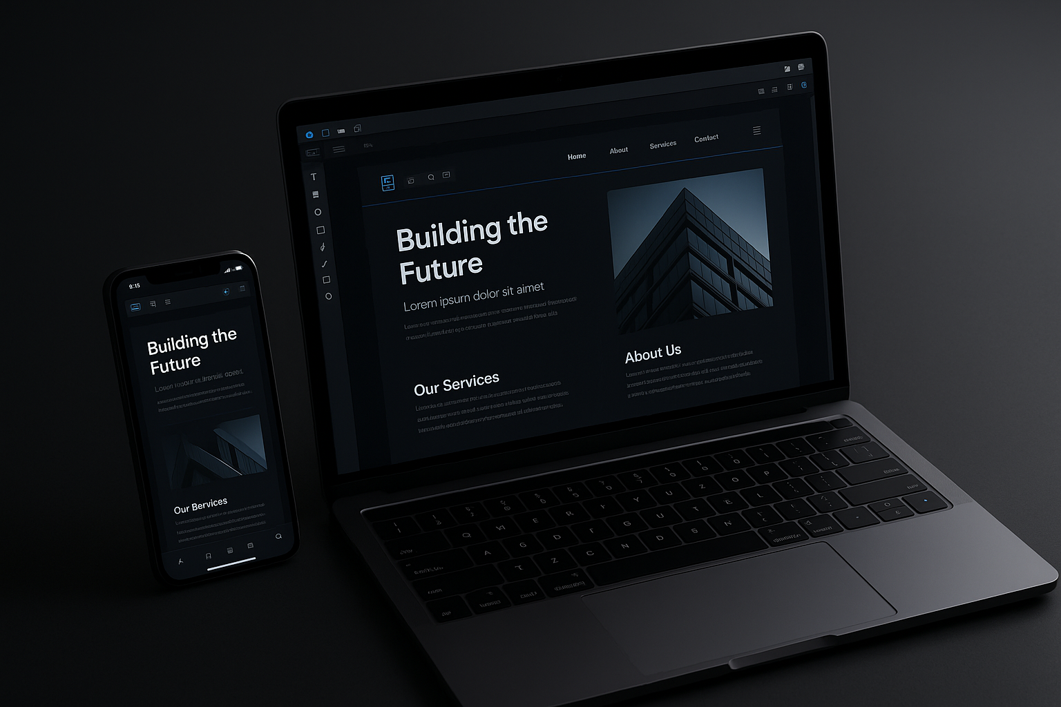
Responsive thinking ties it together. Mobile-first work sets a solid base, then adds complexity only when screens get larger. A layout that reads well on a phone can reveal secondary panels, expanded tables, or richer charts on wider displays. The content leads, the layout adapts, and the visual system stays consistent across breakpoints.
Finally, test on real devices. Emulators help, but they miss how glare, motion, and grip affect use. Watch people complete common tasks. Note where they hesitate. Small improvements to spacing, copy, or order often produce outsized gains because they remove friction at the exact moment decisions happen.
Mobile-first is not a trend. It is a discipline that keeps teams honest about what matters. By designing for the hardest context first, you build an experience that feels direct, fast, and confident everywhere else.